Crafting MeydenVest's Financial Brand: A Collaborative Journey with Sora Union
Sep 8, 2023
Background
In the fall of 2022, Michelle Seitz approached us with a project. She was going to be launching her new firm, MeydenVest Partners, as the culmination of her life’s work. Her goal with MeydenVest was to ensure that deserving businesses solving important societal issues have access to both seasoned strategic advice and patient capital.
Michelle is a very high profile executive and the MeydenVest brand, logo and overall design needed to reflect her mission and also her profile.
By way of example, prior to launching MeydenVest Partners she was the Chairman and CEO of Russell Investments, one of the largest investment advisors in the world, with over $1 Trillion in Assets Under Advisement and operating in over 30 countries, and before that she was the CEO of William Blair Investment Management.
She consistently appears on Barron’s list of “The Most Influential Women in Finance,” and American Banker’s list of the “Most Powerful Women in Finance.”
The challenge
The challenge was to craft an identity that captures the essence of MeydenVest - People focused, Partnership and impact focused. Sora Union collaborated closely with Michelle, in crafting the identity for
the brand.
This involved creating the visual identity, creating the website and all necessary collateral (business cards, signature blocks, video backgrounds etc).
Our approach
To kick start building the brand identity, it required a collaborative process between Sora Union design team and MeydenVest team.
For our first round, we explored ideas around the connection between abtract marks and words that reflects the value of the brand. We sketched abstract logos to capture the concept for each word, going beyond words to think visually from the start.
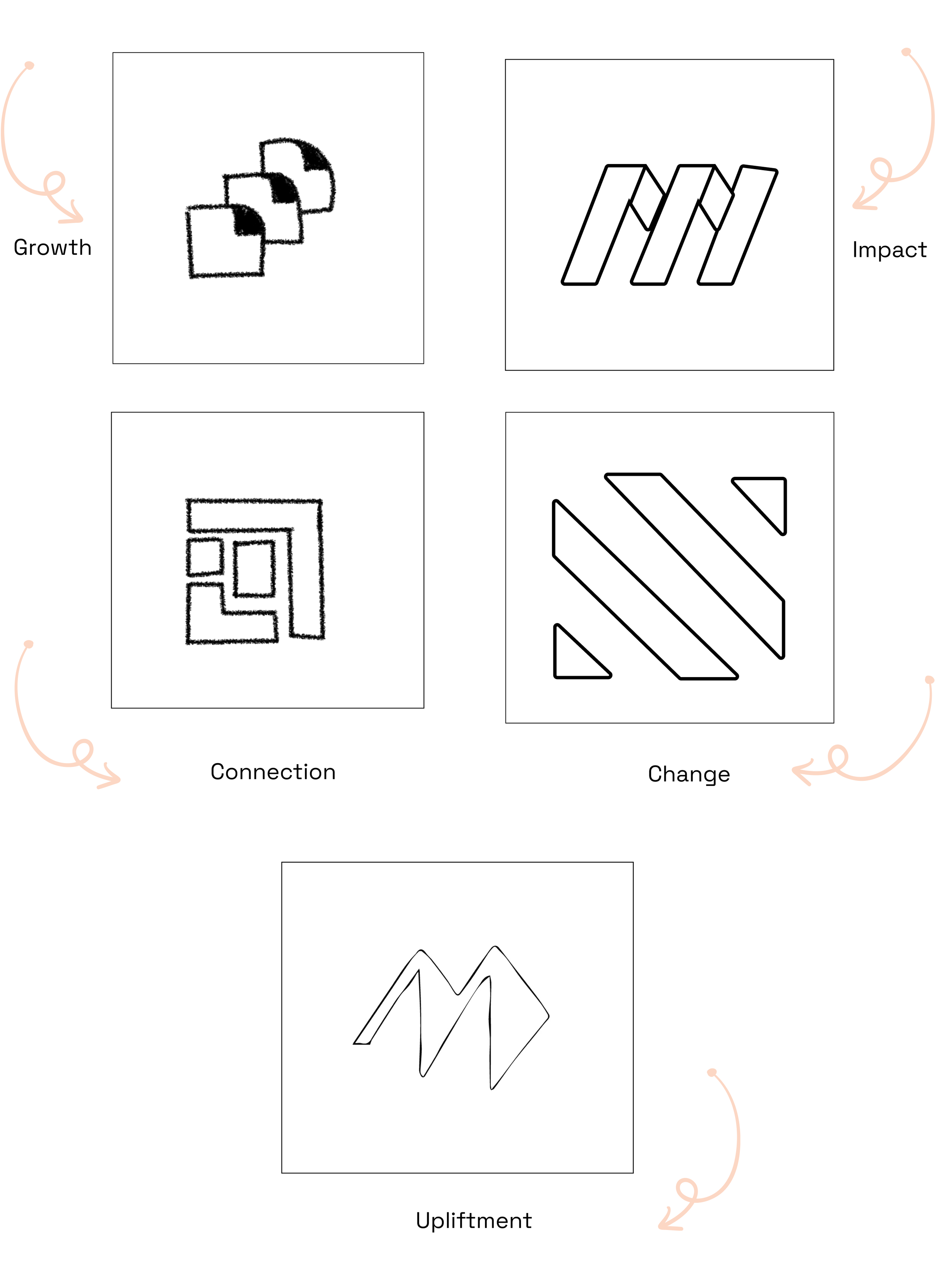
Direction 1 - Abstract marks
For these set of logos, we explored a series of interconnected shapes and ideas that unravels to form new thoughts and conversations.
We examined the values of MeydenVest Partners and came up with a series of brand words that formed the basis for these marks.
Positivity, Empowerment, Inspiring, Impact, Upliftment, Unity, Human Connection and Growth.

Direction 2 - Type exploration
Working closely with the MeydenVest team, we iterated on abstract marks and we all agreed to explore creative ways of using the first letters of the brand name to create the logo mark.
We played with the idea of letters “M”, “MVP” to serve as a visual logo mark for MeydenVest Partners. We tested out serif fonts, like Alice and customized the fonts till we formed these letters into a memorable logo mark that is flexible, and fits in with the brand.
The shortlist
We narrowed our exploration to four options to be presented to the MeydenVest team:
a icon combining typography and shapes to form the letters M and MVP
a typographical option that explored all letters in the brand name that is adaptable to different applications.
The logo is accompanied by a wordmark in lowercase type that is friendly and legible. Monochrome versions of the concepts were first presented. This allowed the client see the concepts without color bias. This was followed by the logos in different color palettes. Mockups were also add to further enabke the MeydenVest team picture what each logo concept would look like in real world application.


The winner: Concept 3
Option 3 was the chosen mark, the mark was perceived as a good use of the letters MVP, as well as clever and stylish.
The team loved how adaptable it was across various forms.
We chose DM Sans as our typeface of choice for its legibility on both digital devices and print media.


Color system
In tandem with the MeydenVest team, we decided on a core palette and a secondary palette.
Our core palette consists of a bold, modern blue that stands out and conveys stability and strength but still fits in the world of corporate finance brands.
Primary colors


Secondary colors


The brand's secondary palette consists of vibrant colors that allows the brand to be more flexible and dynamic. We also came up with different ways to apply this palette alongside the core palette to add more flexibility to the brand.
Sora Union also developed brand guidelines for the identity system that will be used by the MeydenVest team as they grow and continue to create other brand materials.
Marketing Collaterals
MeydenVest needed some immediate marketing materials to help announce the launch of the brand.
Again using our Agile process, once we had the brand identity completed, we quickly worked on the collateral materials working in close collaboration with our colleagues at MeydenVest.
The ask was to create business cards, Linkedin content post, virtual backgrounds for video calls.


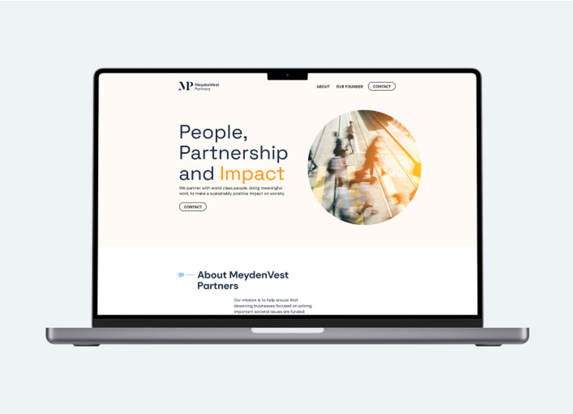
MeydenVest Website
As we started on the design work, we worked in parallel with the MeydenVest team to design the website Layout.
We explored three options using our already defined identity to make some decisions. The team chose the third option because it was fresh and modern and we proceeded to building out the design.

The results
The final result was a fresh, stable and unified identity, visual guidelines and website thatwas delivered speedily by Sora Union in collaboration with the MeydenVest team.
Future plans for the brand will be working on executing its mission to empower teams with seasoned strategic advice and patient capital with the aim of making a sustainably positive impact on society.
“They helped me develop my brand and logo for Meydenvest and then quickly did amazing work on the web content, design, color scheme, and layout. I’m a very happy client. They did great work. I’m smiling from ear to ear. ”


Share this article