How we crafted the Sora brand
Background
Our brief was to develop a name and brand identity for a hyper-creative, reliable, globally distributed knowledge work company, focused on creating work opportunities for individuals affected, and possibly displaced by, climate change or war.
The encompassing brand value and driving force we wanted to capture in this brand were that people are valuable. Often, displaced individuals become a political problem, but what if there was a way to empower such individuals with a steady flow of income, not impacted by their geographical regions or current circumstances.
The challenge
The ask was to create a brand name, visual identity, guidelines, website and social templates.
There were two important groups this identity had to speak to; the companies that would hire talent, and secondly the talent.
The challenge was to craft a brand that would garner the trust of potential clients, but is visually compelling enough to attract creative talent and knowledge workers.
Our approach
Foundational, guiding questions
Two questions led our exploration:
What do we want people to feel when they encounter this brand?
What is the narrative that encompasses the facts and feelings that our brand creates?
Naming round 1
With these questions in the back of our minds, we conducted two extensive rounds of name generation.
For our first round, we created several high-level territories and descriptions that felt true to the goals of this company.
Connection: Reciprocity, Relation, Communicate
Resourceful: Confident, Wise, Conscientious
Foundational: Necessary, Indispensable
Community: Utopia/New world, Refuge, New opportunities
Impact: Transformation, Energy, Power
Elite: Knowledge, Premium, Sought after
Creative: Innovative, Ingenious, Brave
During this process, our team members also sketched abstract logos to capture the concept for each naming direction, going beyond words to think visually from the start.

Naming round 2
Upon sharing round one’s names with the stakeholders, the names they preferred fell into four larger brand concepts:
Sky
Meeting + Connection
Visitor
Welcoming strangers
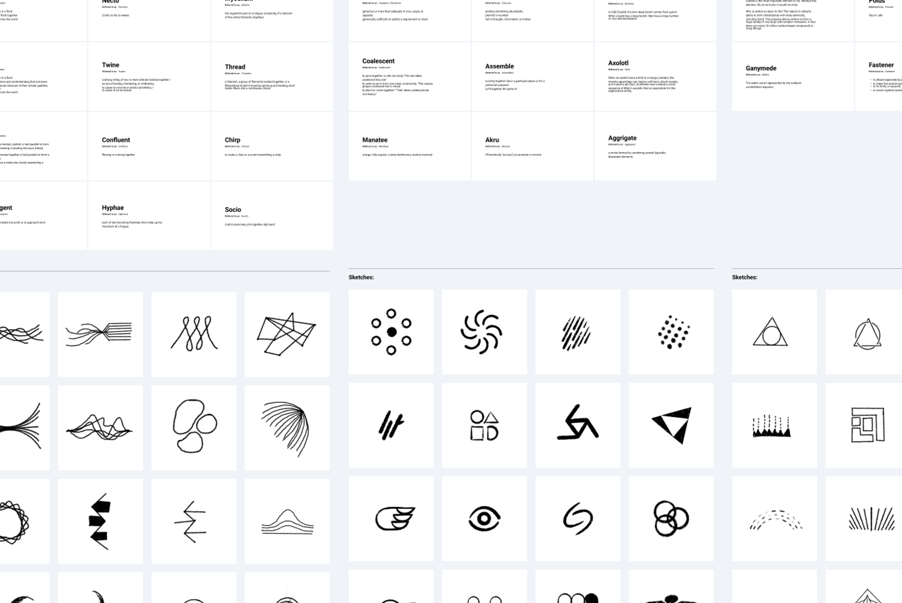
We explored a range of new options resonating with these concepts - creating an extensive list of more than 900 names in total. We prioritized words that phonetically sounded lyrical, beautiful, and inherently inspirational.
Each of these words, rooted in non-English languages, represented values we honored.

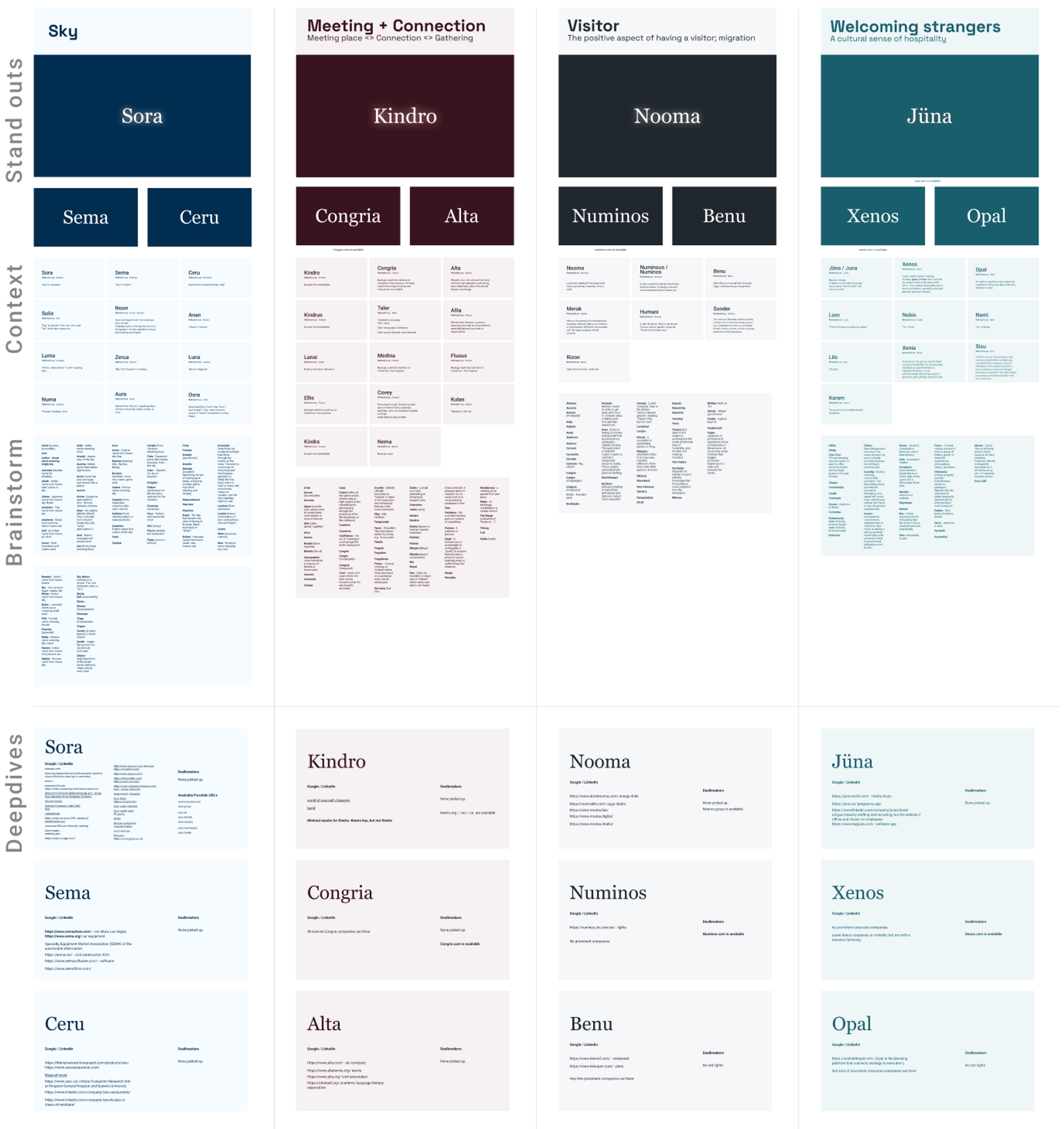
The Shortlist
The stakeholders picked three options to move forward with:
Sora
meaning ‘sky’ in Japanese
Nooma
meaning ‘wind or spirit’, a phonetic spelling of the Greek word πνευμα (pneuma)
Juna
meaning ‘mutual’ in Hausa; “clod of earth” and “source of life” in Saliba.
Harmony between the name and visual identity was incredibly important, and to help us determine which name feels the best, we developed and executed a range of identities for all 3 names, spanning a wide visual spectrum.
Visual exploration exercises with the top three
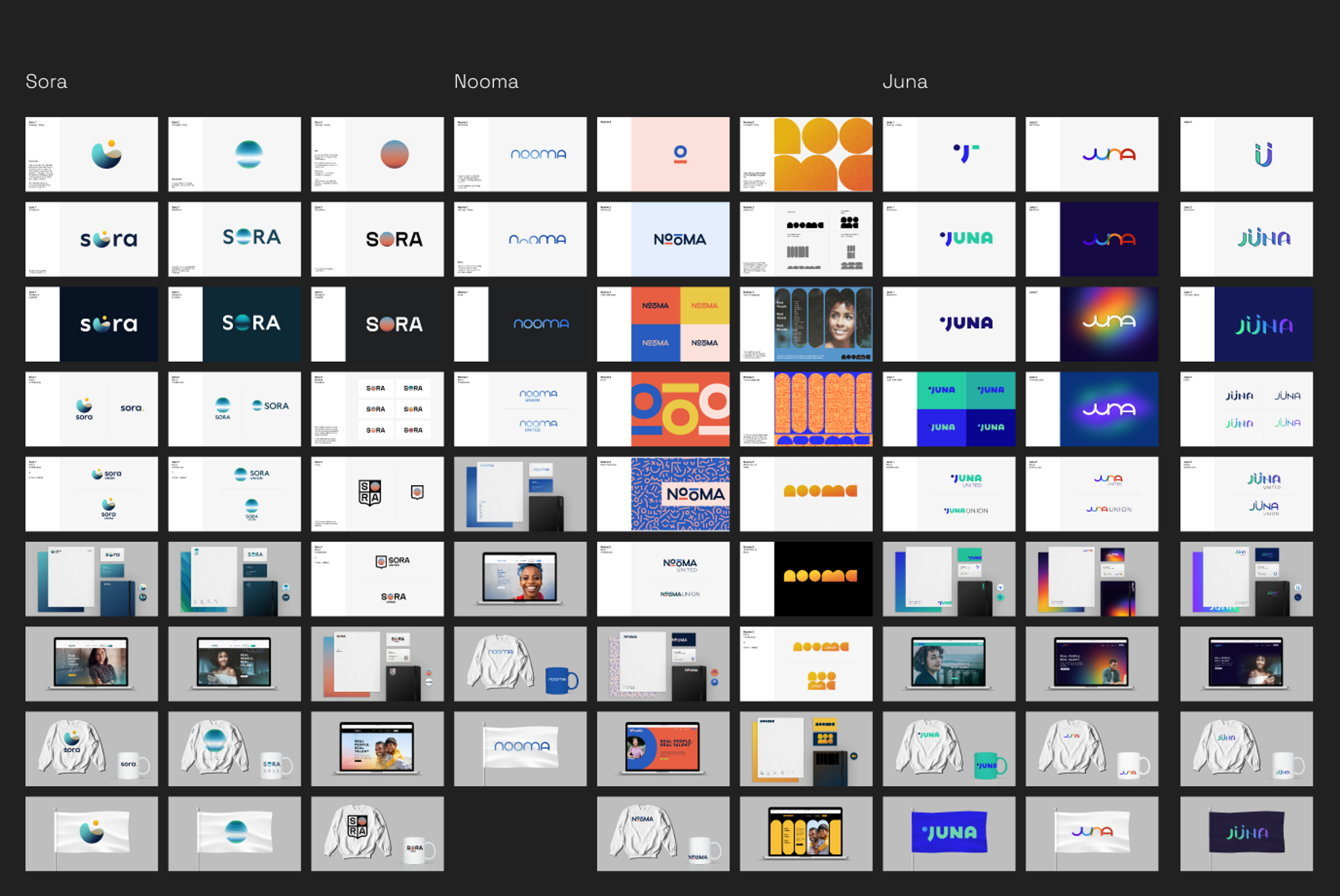
With the shortlist of three options, we did an in-depth visual study of how these options could come to life. The intent of this round was to help the stakeholders narrow down the final option.
The winner: Sora
The stakeholders unanimously chose Sora to move forward with.
During our explorations, we looked at a variety of words meaning “sky” in different languages, yet the word Sora was the one that stood out. It sounds like the word soaring, by definition flying or rising high in the air. It also felt regal, aspirational, and melodic to pronounce.
The impact of war and climate change can ultimately force people out of their “motherland”, those geographical regions they grew up in. If you take away the mountain ranges, deserts, or valleys that were home to you, what will remain when you’re forced to move to another region or country? The sky; the sunsets and the stars. Sky was the narrative that encompassed our brand.
Sora Creative Explorations
With the final name chosen, we were encouraged to keep pushing on the visuals. We explored logos, with a back and forth between high and low-fidelity to ultimately find an identity that embodies our concept and differentiates us from other brands.
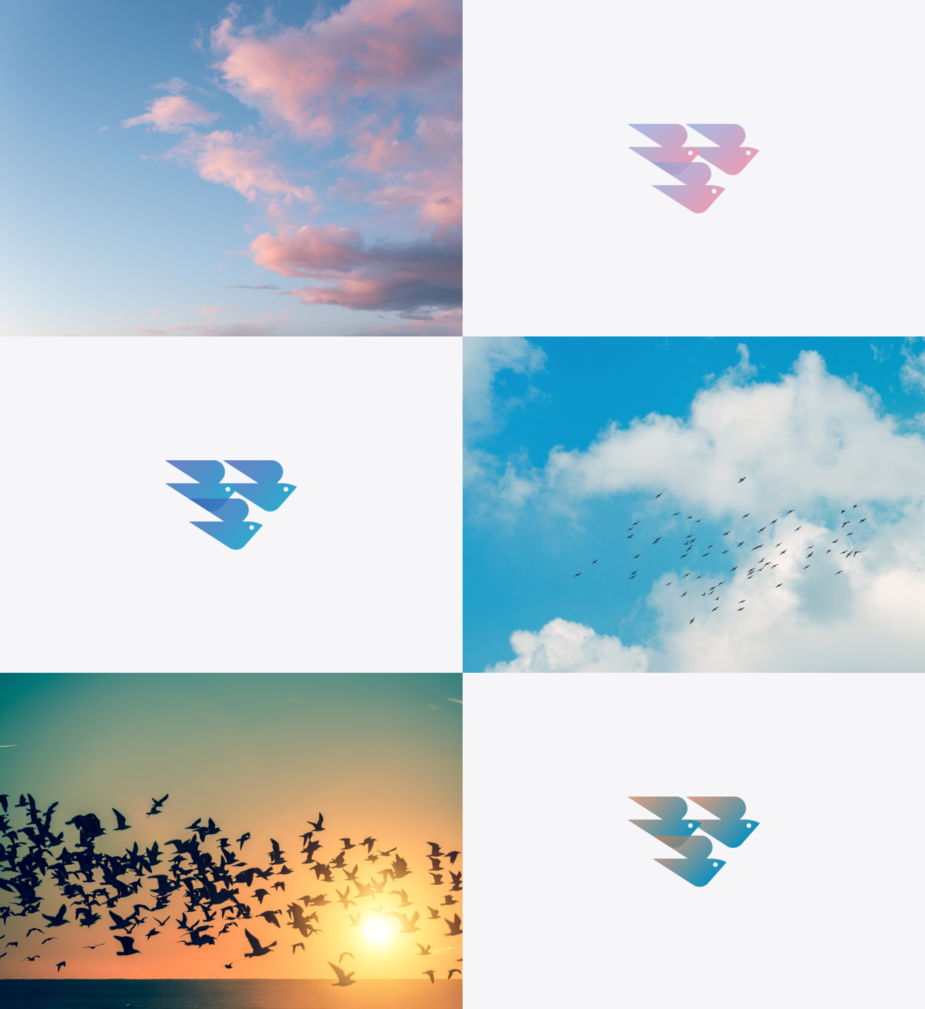
Through this process, several elements of the sky fascinated us: birds, clouds, the sun, and the globe itself.
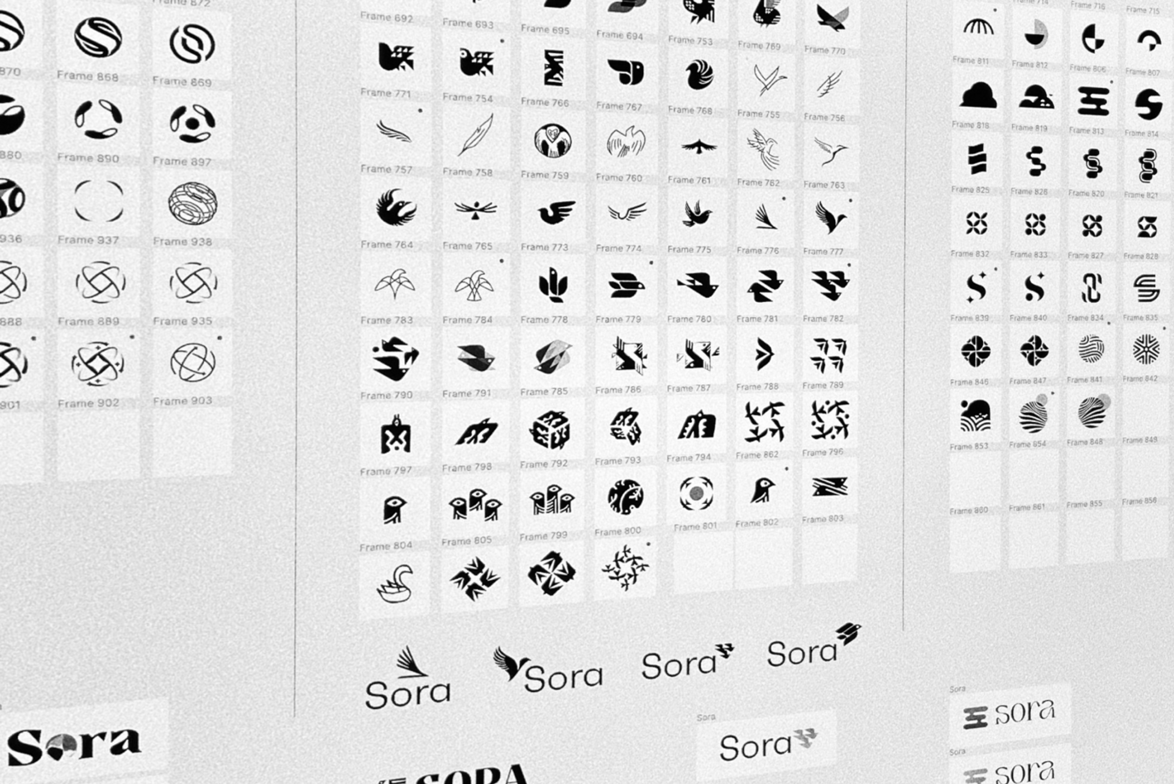
The final 4 options

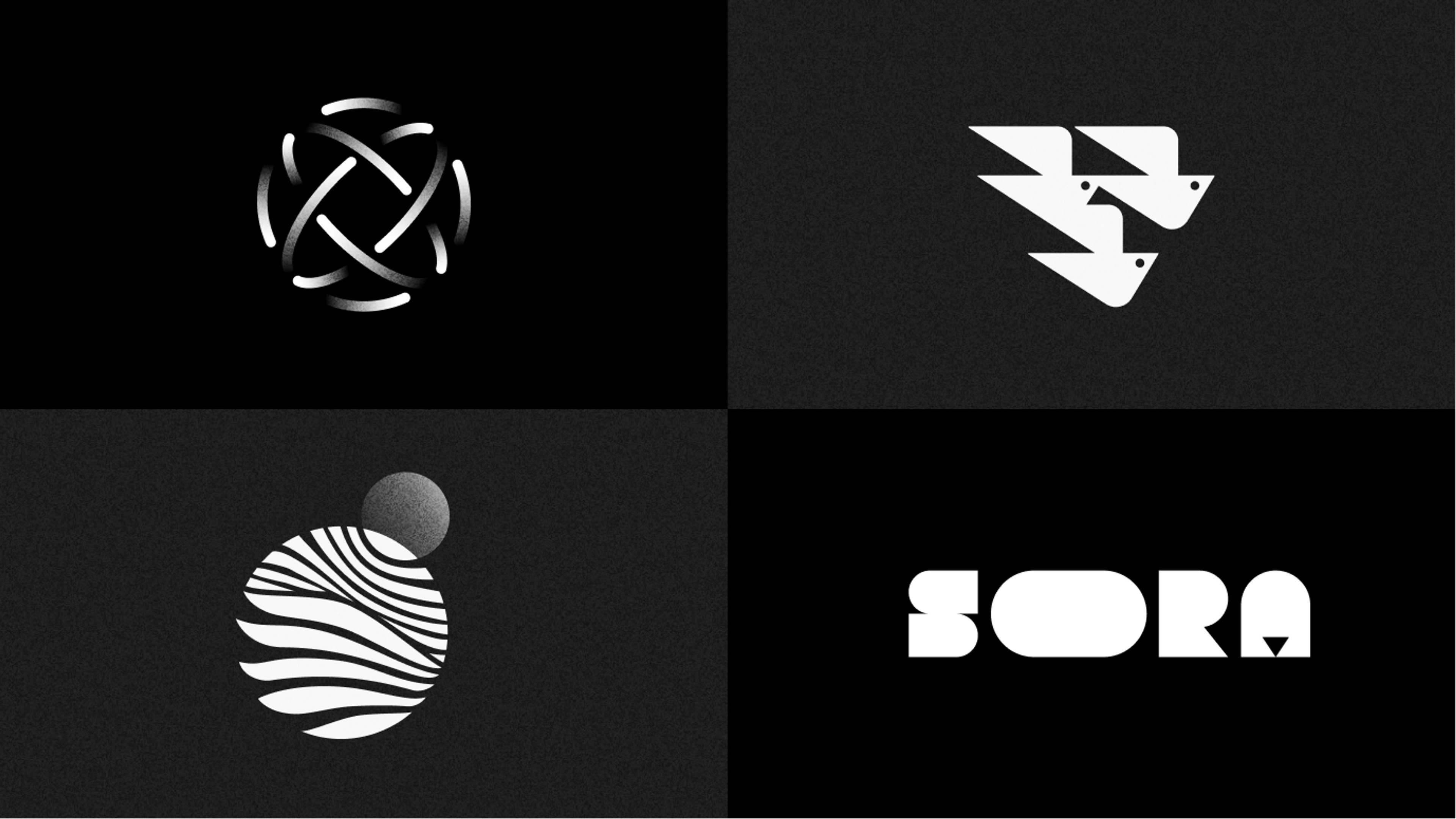
We presented four brand identities to our stakeholders:
a dynamic globe eluding to connectedness and collaboration
three birds in flight, representing a flock of migratory birds
an icon combining a sun/moon, sky and bird wingspan
a typographical option that flexed and adapted to different applications.

The chosen option
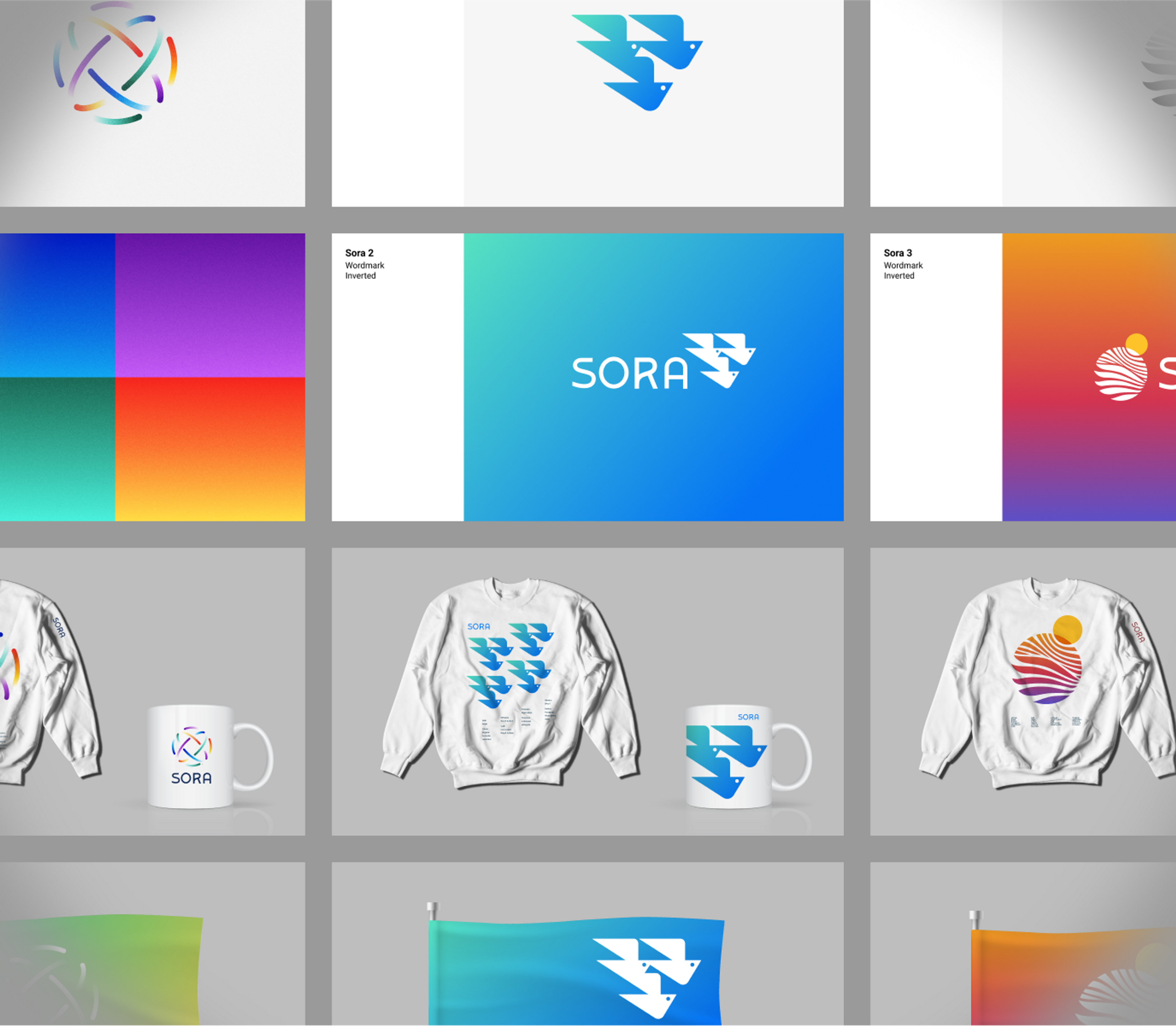
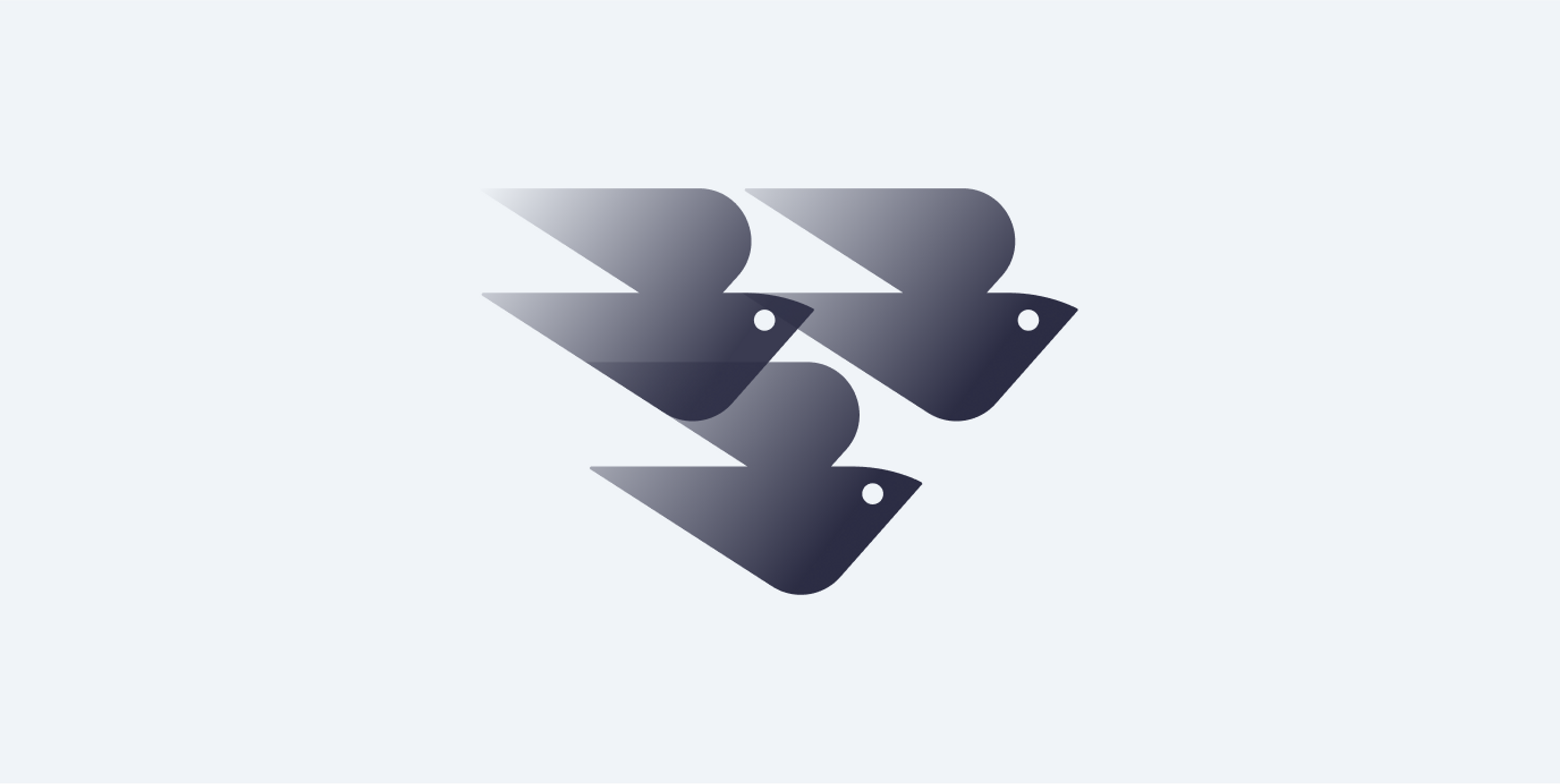
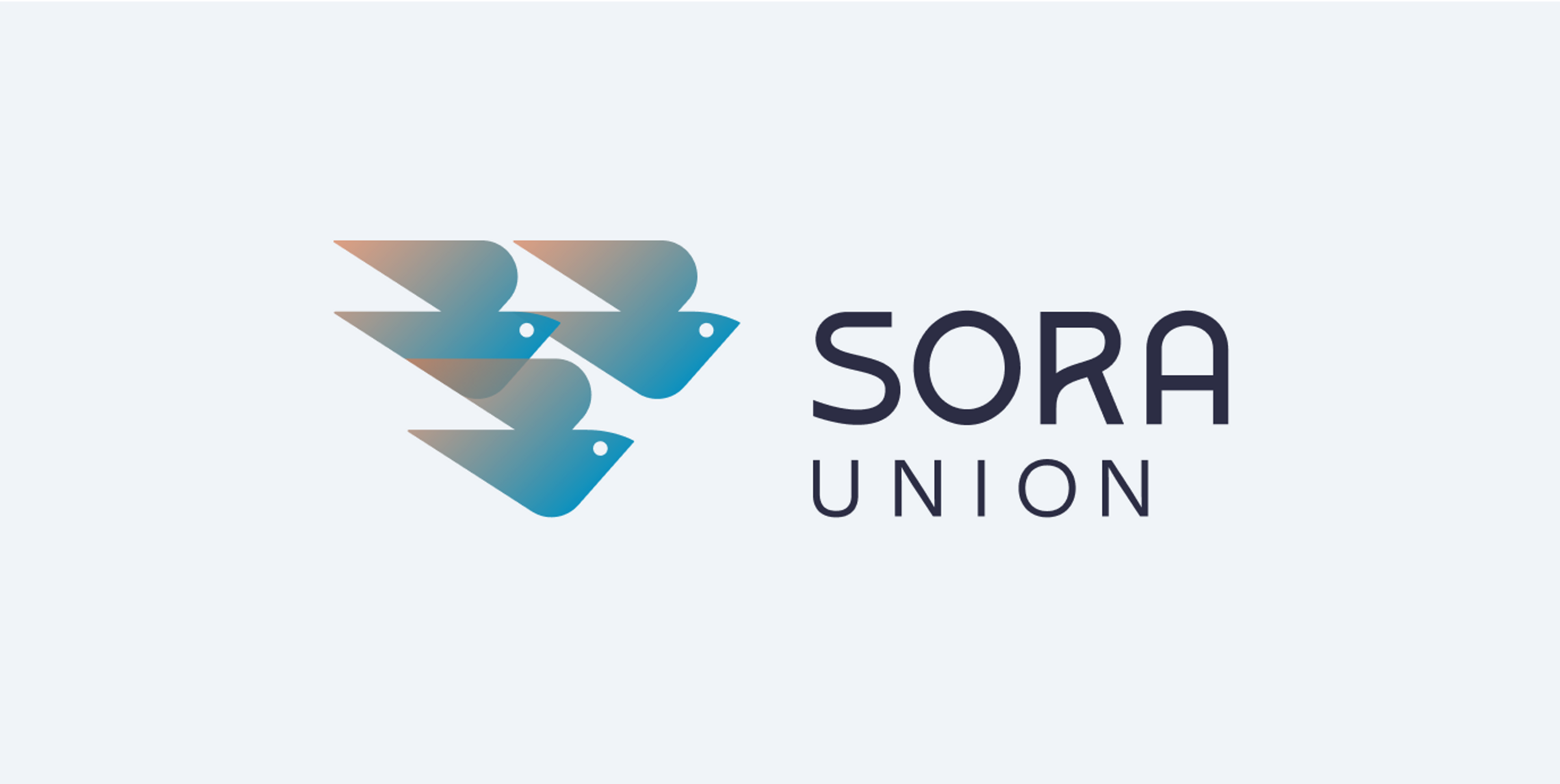
Option 2, the flock of birds, was the overwhelming favorite and resonated deeply with our values. Migrating birds capture the essence of Sora Union most aptly. Individual birds are vulnerable to natural elements and various predators. Migratory flocks of birds are a strong metaphor for community, teamwork and stealth. Scientists still don’t understand how birds flying in murmuration, do not collide with each other.

We spent more time focusing on and refining the icon.

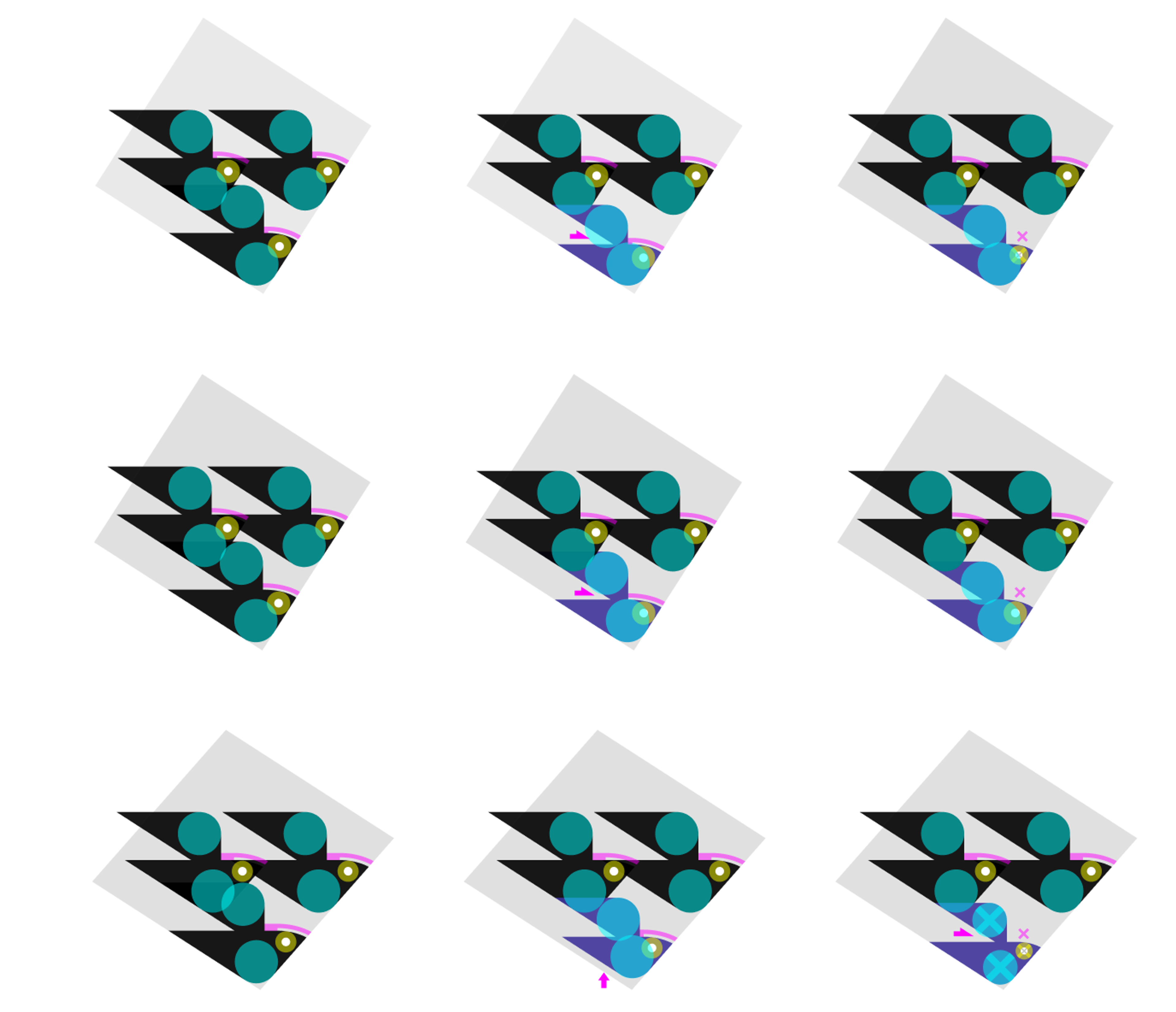
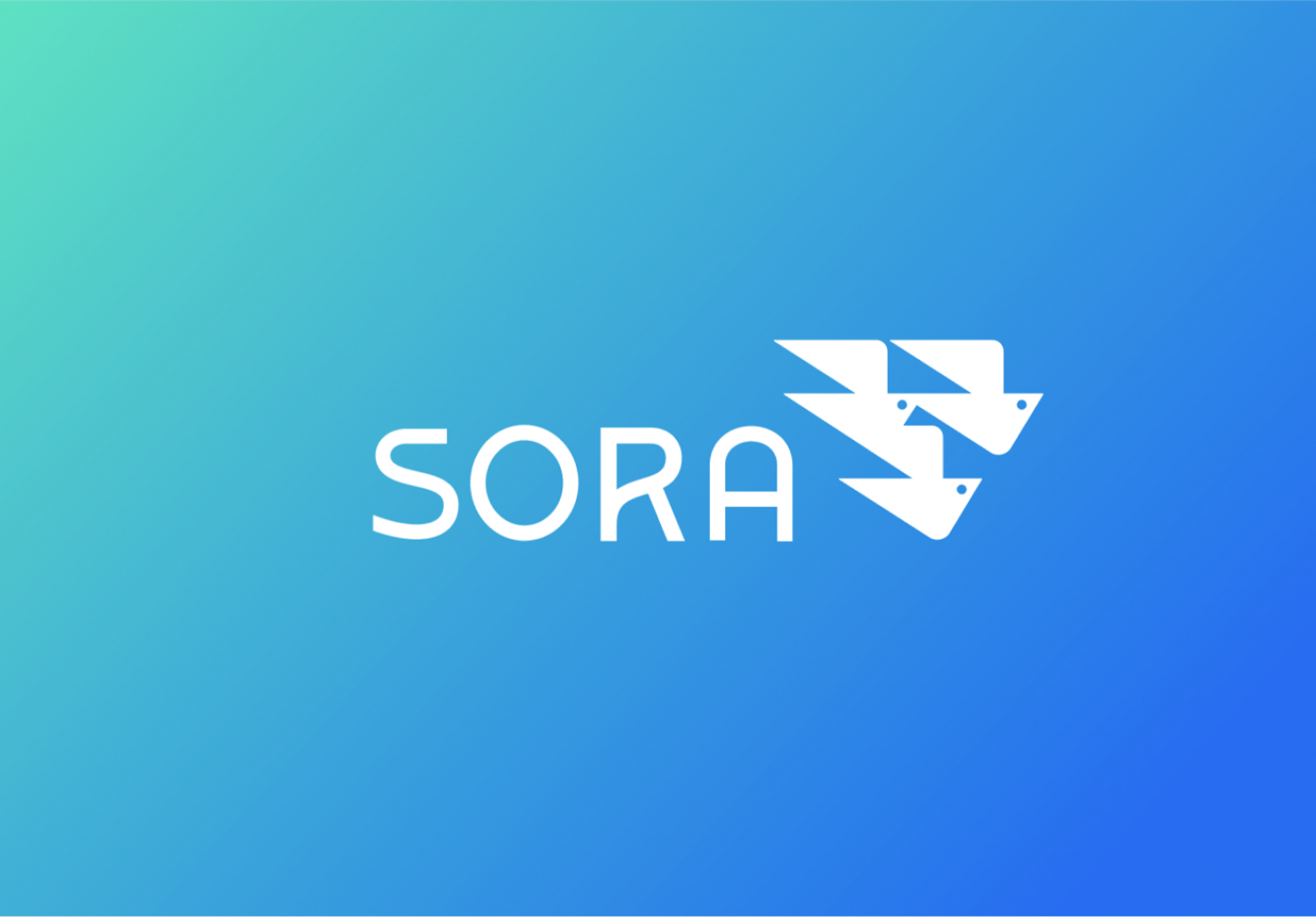
We laid out the three versions of bird compositions, with minute but significant changes to the curves of the beak and wing shapes, to arrive at the right feeling.
The final icon felt multifaceted, elegant and geometrically precise.

Typography Research
We tested hundreds of typeface weights and alignments in order to find the perfect combination with the logo.

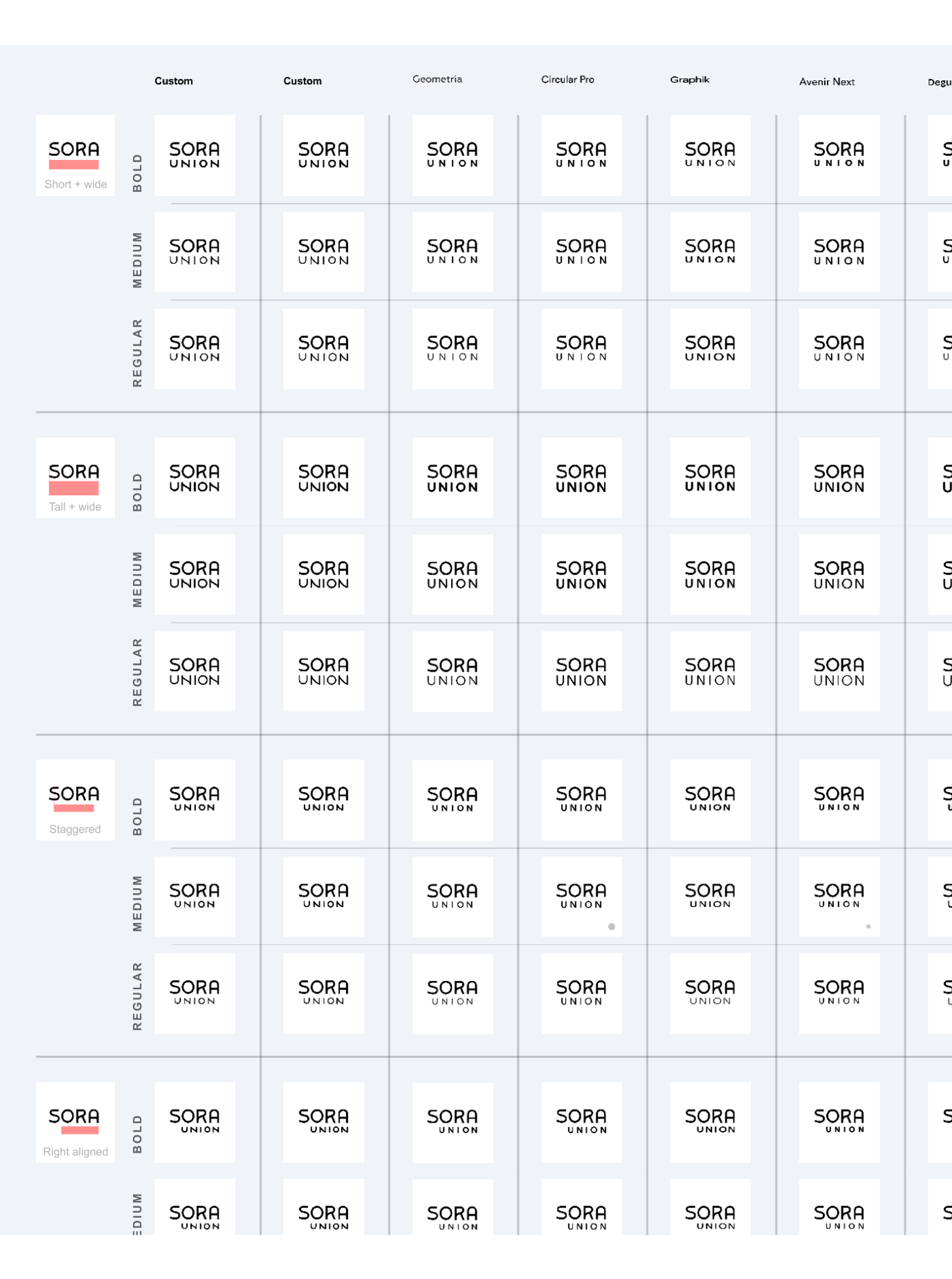
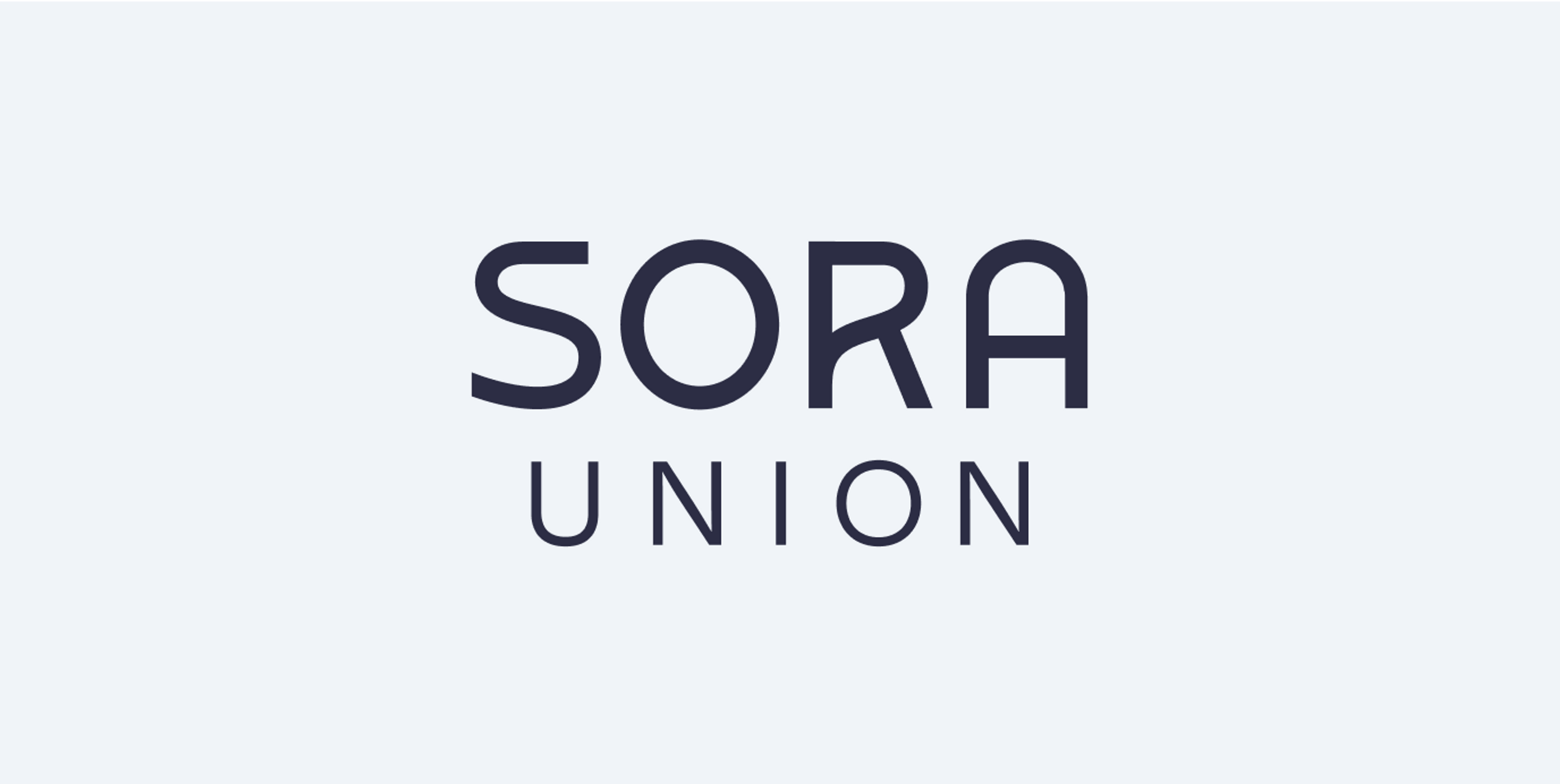
Ultimately, we crafted each of the letters to create a bespoke word mark. The font for the word “Union” that stood out, came from a Google font called - wait for it - Sora.
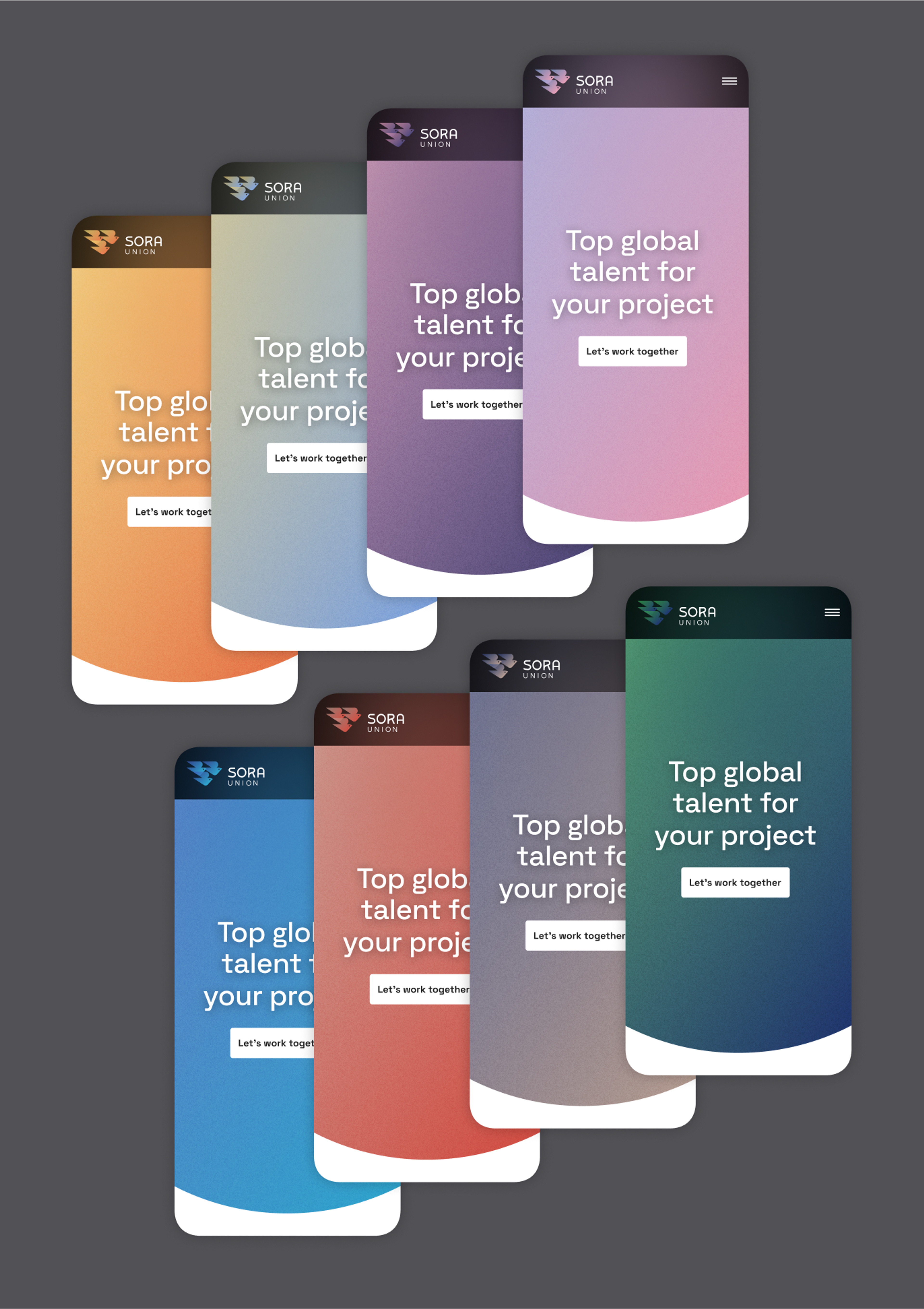
The color system
What color is the sky? A simple answer might be blue. Yet, as we explored different visual references, we were inspired to see as much variety in colors as in the cultures represented by Sora’s workforce.

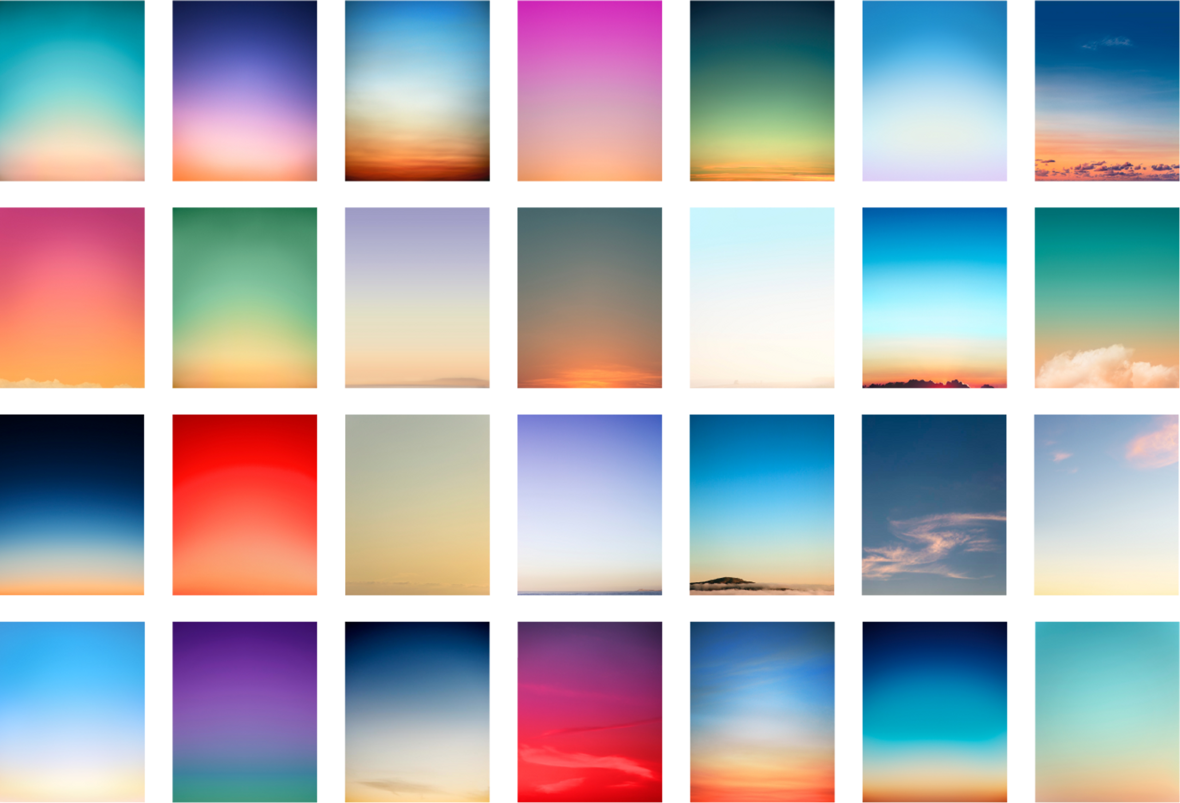
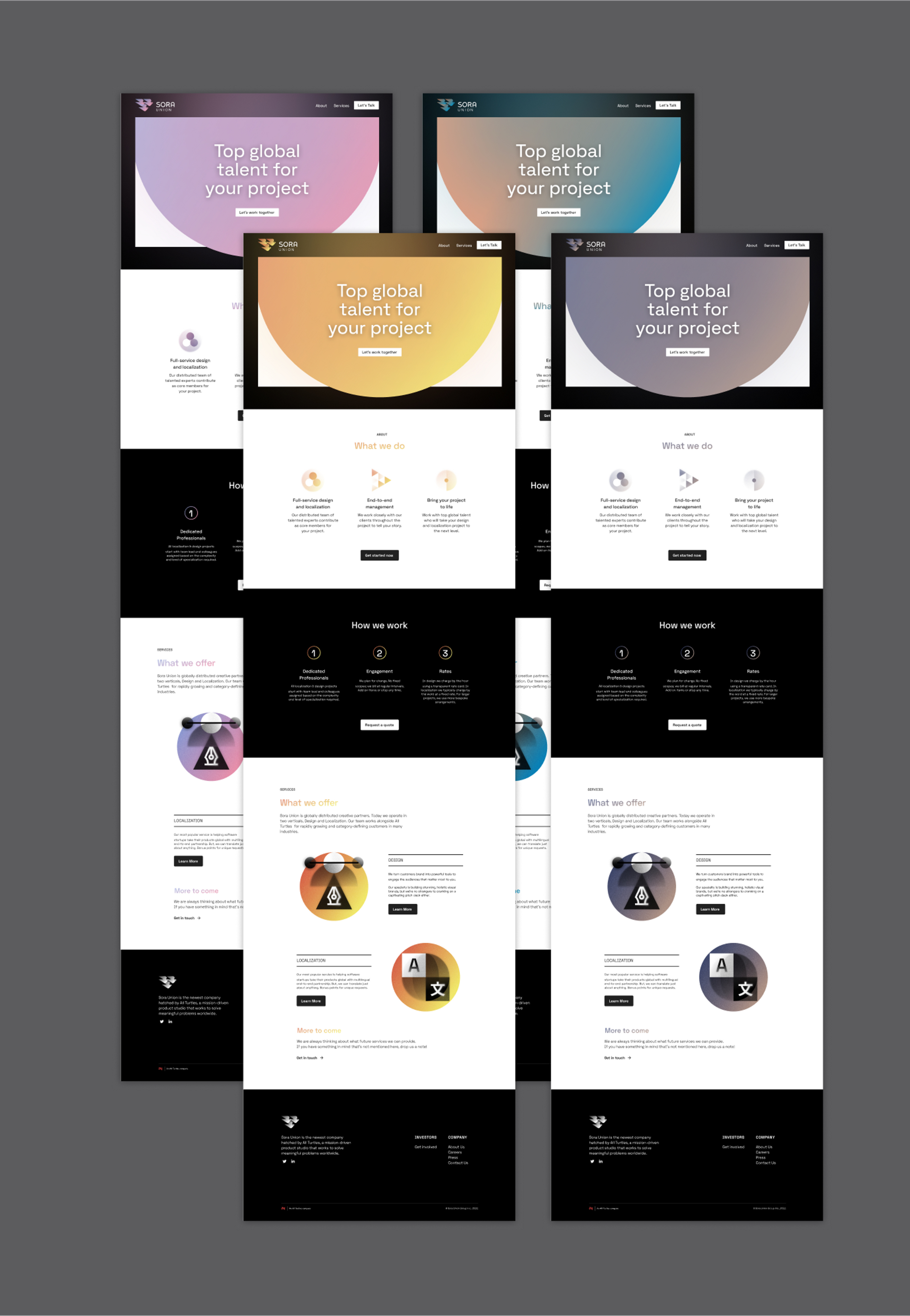
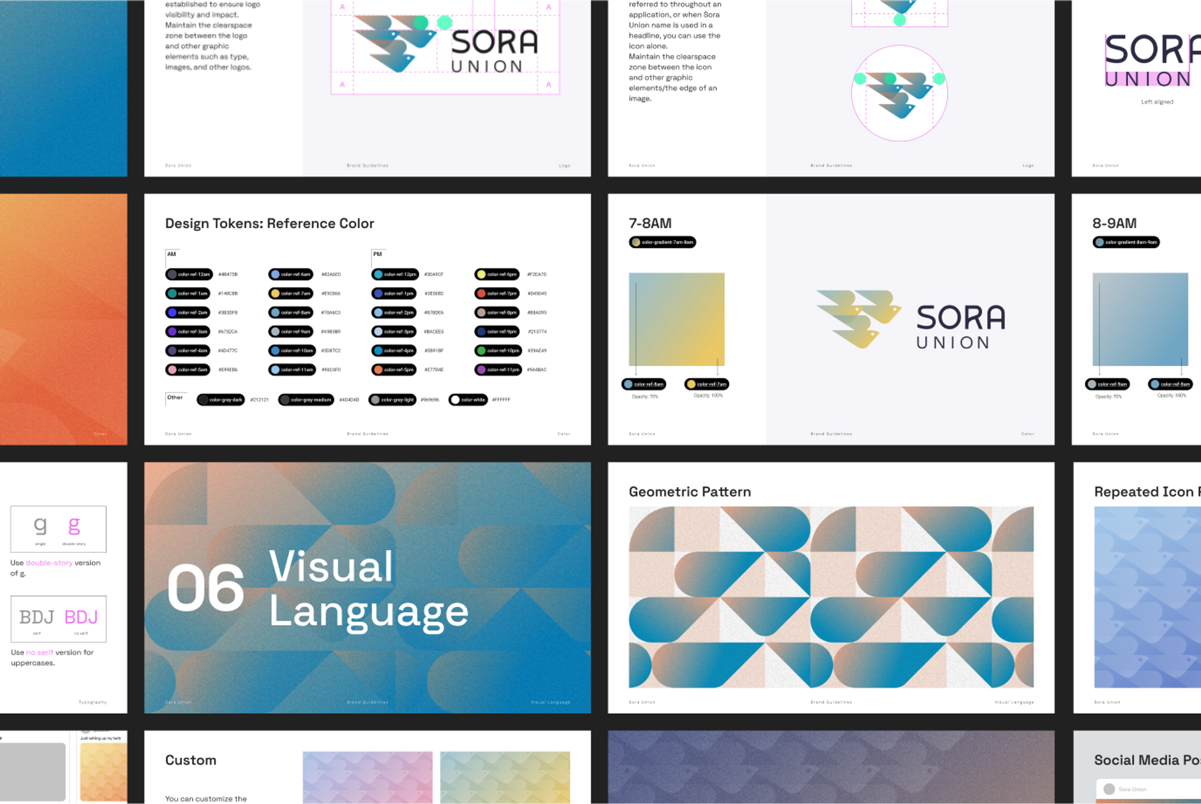
We challenged ourselves to come up with a brand color system that could capture the changing colors in the sky - down to the hour. The result was a 24-hour color system for our brand palette.

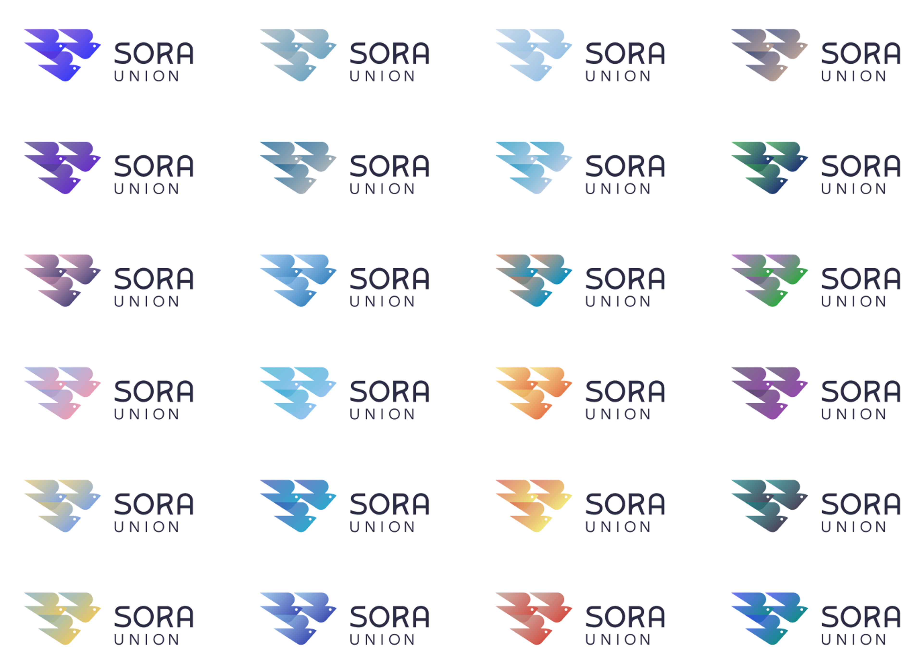


This dynamic system comes to life on our website, with the background gradients transitioning every hour linking the current hour to the next one visually. Our color palette expresses the ever-changing nature of the sky above our global team and clients. The colors on the website are personalized to the visitor’s time zone but remain connected to all others through our 24-hour system.
If it's 5 pm, you will see the orange sunset color; if it's 11 am, you will see the clear blue sky. A one-time visitor might not even notice the changing hues of our website’s color palette. We aim to engage deeply with our partners, and we hope repeat visitors will be inspired by Sora Union's dynamism and bold color.
The final results
The final result was a robust identity system that both exudes quality and aspiration, with an innovative color system and memorable website.

One of our leading questions at the beginning of this project, was “What do we want people to feel when they encounter this brand?”
On the one hand, we wanted Sora Union to make people feel inspired, uplifted and hopeful. On the other hand, we wanted to communicate the values of a hyper-creative, competent, globally distributed workforce.
We believe that the combination of brand elements accomplishes what we set out to do.


Share this article