


BRAND DESIGN CASE STUDY
The Sora Union Brand Story
We were requested to develop a brand identity for a company offering a variety of services executed by hyper-creative, hyper-reliable, globally distributed knowledge workers; knowledge workers who all happen to be affected and possibly displaced by climate change or war.
The encompassing brand value and driving force that we wanted to capture in this brand was that people are valuable. Often, displaced individuals become a political problem, but what if there were a way to empower such individuals with a steady flow of income, not impacted by their geographical regions or current circumstances?
The task was to create a brand identity that unpacks how our brand tells our story.
Client
Sora Union
Deliverables
Brand Identity
Web Design
Web Developmentk
Year
2022
BRAND IDENTITY
The challenge was to craft a brand that would garner the trust of clients and talent
There were two important groups this brand had to speak to; the companies that would hire talent, and secondly the talent. The challenge was to craft a brand that would garner the trust of potential clients, but is visually compelling enough to attract creative talent and knowledge workers.
2 Questions lead our exploration:
- What do we want people to feel when they encounter this brand
- What is the narrative that encompasses the facts and feelings that our brand creates?
Our Approach
Naming: 2 rounds
For our first round, we created several high level territories + descriptions that felt true to the goals for this company.
Connection: Reciprocity, Relation, Communicate
Resourceful: Confident, Wise, Conscientious
Foundational: Necessary, Indispensable
Community: Utopia/New world, Refuge, New opportunities
Impact: Transformation, Energy, Power
Elite: Knowledge, Premium, Sought after
Creative: Innovative, Ingenious, Brave
During this process, our team members also sketched abstract logos to capture the concept for each naming direction going beyond words to think visually from the start.


Concept exploration
Upon sharing round one’s names with the stakeholders, the names they preferred fell into 4 larger brand concepts:
Sky
Meeting + Connection
Visitor
Welcoming strangers
We explored a range of new options resonating with these concepts, creating an extensive list of more than 900 names. We prioritized words that phonetically sounded lyrical, beautiful, and inherently inspirational. Each of these words, rooted in non-English languages, represented values we honored.
Shortlist
The stakeholders picked three options to move forward with:
- Soraㅤㅤㅤㅤㅤㅤㅤㅤㅤㅤㅤㅤㅤㅤㅤㅤㅤㅤㅤmeaning ‘sky’ in Japanese
- Noomaㅤㅤㅤㅤㅤㅤㅤㅤㅤㅤㅤㅤㅤㅤㅤㅤㅤㅤmeaning ‘wind or spirit’, a phonetic spelling of the Greek word πνευμα (pneuma)
- Jünaㅤㅤㅤㅤㅤㅤㅤㅤㅤㅤㅤㅤㅤㅤㅤㅤㅤㅤㅤmeaning ‘mutual’ in Hausa; “clod of earth” and “source of life” in Saliba.
Visual Explorations
With the shortlist of 3 options, we did an in-depth visual study of how these options could come to live. The intent of this round was to help the stakeholders narrow down the final option.
Harmony between the name and visual identity were incredibly important to help us determine which name feels the best.


The winner: Sora
The stakeholders unanimously chose Sora to move forward with.
During our explorations, we looked at various words meaning “sky” in different languages. Yet, the word Sora was the one that stood out. It sounds like the word soaring, flying, or rising high in the air. It also felt regal, aspirational, and melodic to pronounce.
The impact of war and climate change can ultimately force people out of their “motherland,” those geographical regions they grew up in. Suppose you remove the mountain ranges, deserts, or valleys that were home to you. What will remain when you move to another region or country? The sky, the sunsets, and the stars.
Sky was the narrative that encompassed our brand.
We presented four brand identities to our stakeholders:
- A dynamic globe eluding to connectedness and collaboration
- Three birds in flight, representing a flock of migratory birds
- A typographical option that flexed and adapted to different applications
- An icon combining a sun/moon, sky, and bird wingspan

Evolving the chosen logo
The flock of birds, was the overwhelming favorite and resonated deeply with our values. Migrating birds captures the essence of Sora Union most aptly.
Individual birds are vulnerable to natural elements and various predators, and migratory flocks of birds are a potent metaphor for community, teamwork, and stealth. Scientists still don’t understand how birds flying in murmurations don’t collide with each other.


Refining the icon
We further refined the bird logo to live up to our keywords of “hyper-creative” and “hyper-reliable”. Even the smallest detail down to the roundedness of the beak mattered.
We laid out a range of the three bird compositions versions, with significant changes to the curves of the beak and wing shapes, to arrive at the right feeling. The final icon felt multifaceted, elegant and geometrically precise.
Typography research
Our attention to detail extended to the typeface. We tested hundreds of typeface weights and alignments to find the perfect combination with the logo.
Ultimately, we crafted each of the letters to create a bespoke wordmark. The font for word “Union” that stood out, came from a google font called - wait for it - Sora.


Dynamic 24-hour color system
What color is the sky?
A simple answer might be blue. Yet, as we explored different visual references, we were inspired to see as much variety in colors as in the cultures represented by Sora’s workforce.
We challenged ourself to come up with a brand color system that could capture the changing colors in the sky, down to the hour. The result was a 24-hour color system for our brand palette.

Color System Final Result
Our color palette expresses the ever-changing nature of the sky above our global team and clients.
The colors on the website are personalized to the visitor’s time zone but remain connected to all others through our 24-hour system. The background gradients transitioning every hour linking the current hour to the next one visually. If it's 5 pm, you will see the orange sunset color; if it's 11 am, you will see the clear blue sky.
A one-time visitor might not even notice the changing hues of our website’s color palette. We aim to engage deeply with our partners, and we hope repeat visitors will be inspired by Sora Union dynamism and bold color.


Final Result
The final result was a robust identity system that exudes premiumness, inspired with an innovating color system and a memorable website.
One of our leading questions in the beginning of this project, was:
“What do we want people to feel when they encounter this brand?”
We wanted Sora Union to make people feel inspired, uplifted and hopeful. On the other hand we wanted to communicate the values of a hyper creative, competent, globally distributed workforce. We believe that the combination of brand elements accomplish what we set out to do.


Web Design


Share this article
Portfolio Showcase
Our Work
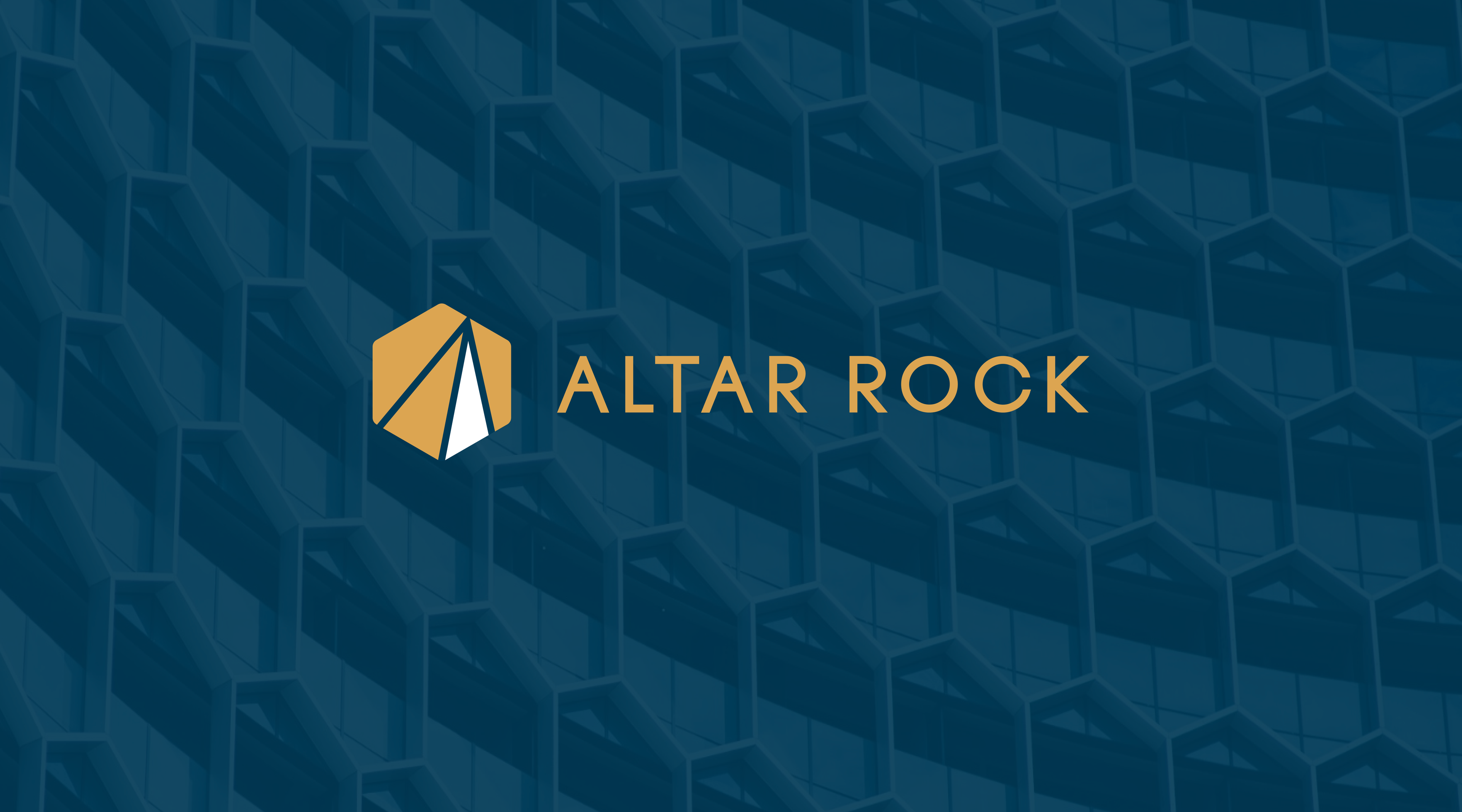
Altar Rock Rebrand: Building Financial Trust Through Comprehensive Design Solutions
Altar Rock LLC, as an SEC registered investment adviser specializing in wealth management for affluent families, aimed to refresh its brand and online presence to better convey its commitment to innovation and trust. To achieve this, Altar Rock engaged our team to update its logo, redesign its website, and create a new presentation deck template, communicating Altar Rock's commitment to innovation, integrity, and excellence.
Read More
Gnomon Alpha Rebrand: Redefining Market Position and Crafting a Bold Identity
Trident Capital, now rebranded as Gnomon Alpha, is an investment management firm that redefined its market positioning and brand identity to enhance its presence in the asset management industry. Our team partnered with Gnomon Alpha to conduct in-depth market research, lead the renaming exercise, develop a cohesive brand identity, and design a dynamic new website. We continue to provide ongoing marketing support through periodic collateral, ensuring the brand remains agile and impactful in a competitive marketplace.
Read More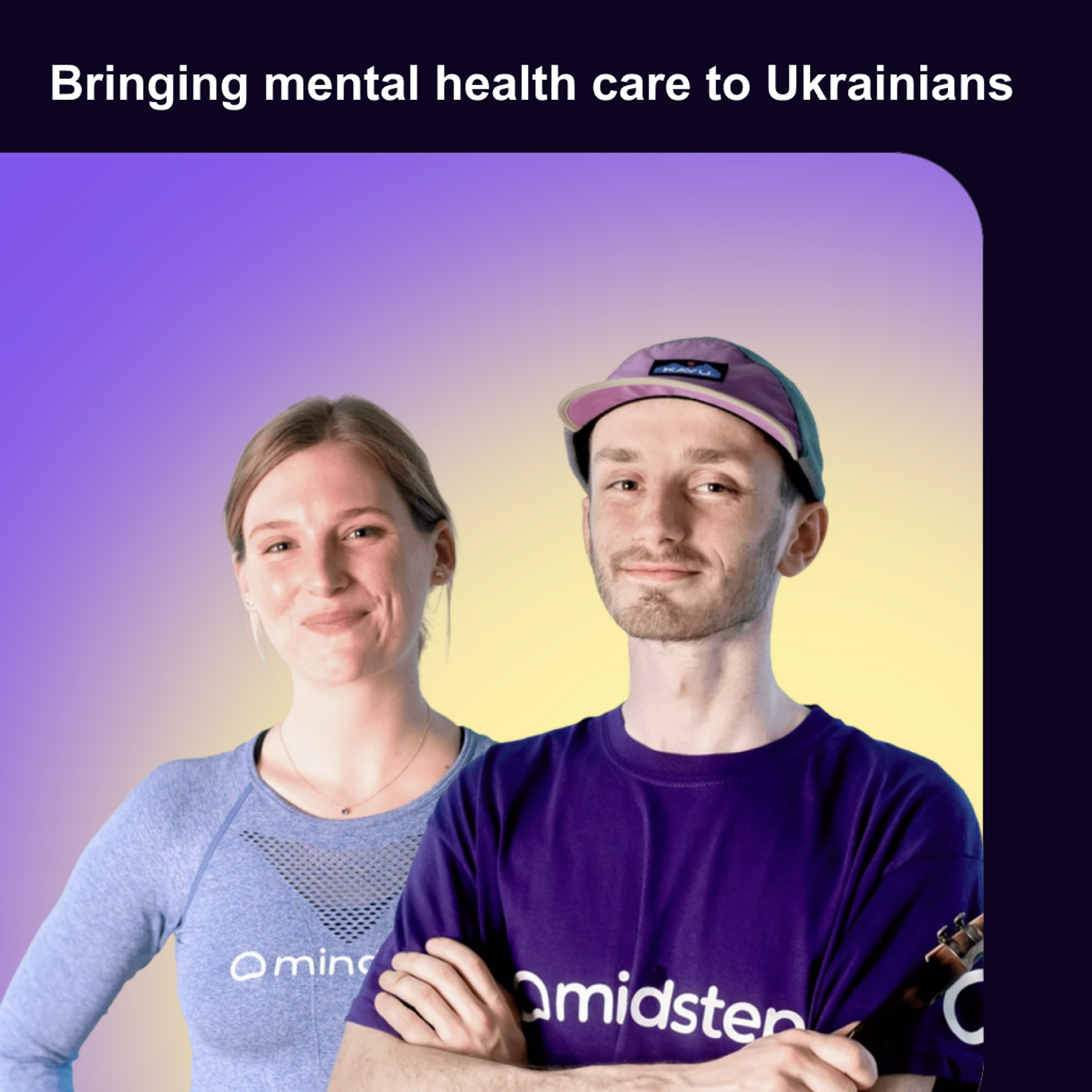
Health Tech Without Borders, in partnership with Sora Union and Mindstep
Health Tech Without Borders, in partnership with Sora Union and Mindstep, has launched a free mental health application for displaced Ukrainians in the UK The campaign is calling UK-based Ukrainians to take part in the testing, further shaping its effectiveness and providing critical insights into a range of neurological conditions The campaign further highlights how the utilization of tech removes significant barriers to accessing appropriate care
Read More
Exploring Carrot’s Creative and Linguistic Transformation
Carrot, a global group committed to providing fertility care for everyone, partnered with Sora Union to overhaul its branding, marketing collateral, and localization efforts. With a mission to break barriers in access to fertility care regardless of demographics, Carrot sought a comprehensive transformation to reflect its inclusive mission and global reach.
Read More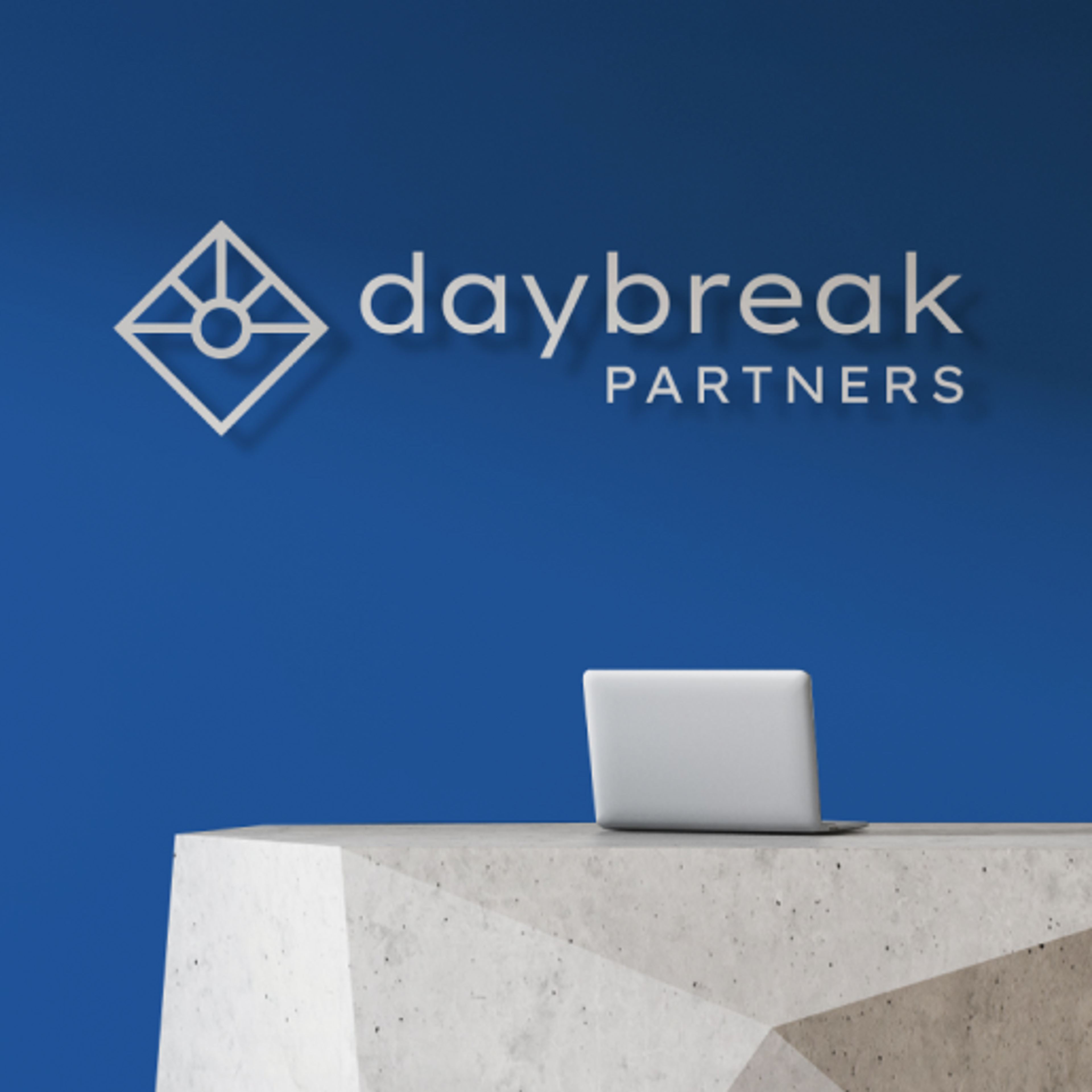
How We Transformed Daybreak Partners
Daybreak Partners, dedicated to transforming entrepreneurial visions into successful ventures, partnered with Sora Union to elevate its brand identity and digital presence in the healthcare and tech investment sector. Our collaborative mission, including a website and logo redesign, aimed to align with industry trends, ensuring a clean, accessible design and delivering an informative and engaging user experience.
Read More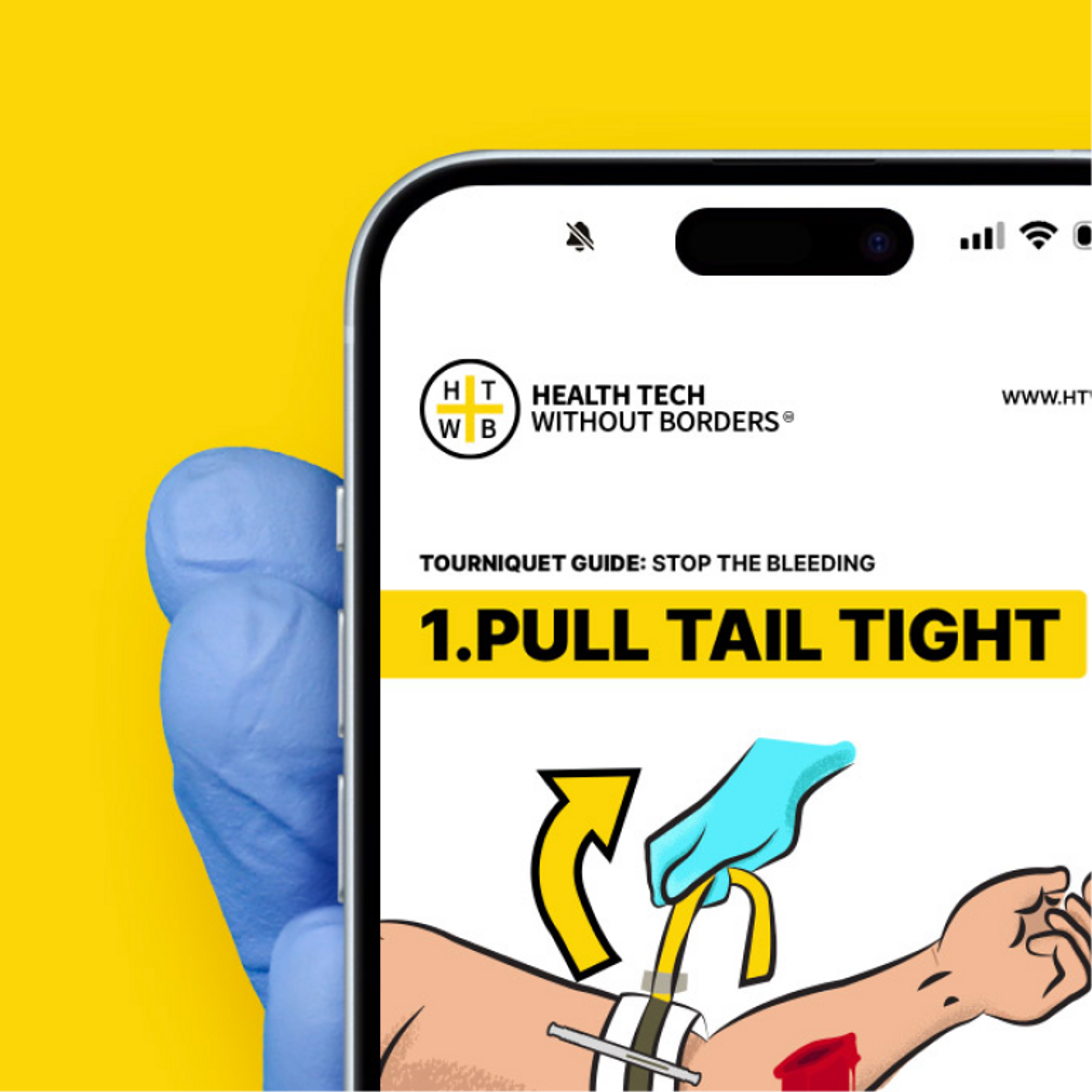
How we visualized HTWB's TacMed Chatbot: Stop the Bleeding
Health Tech Without Borders (HTWB), a global non-profit dedicated to emergency medical support, collaborated with Sora Union to enhance the Tactical Medical (TacMed) Chatbot. Focused on supporting frontline responders in Ukraine, the request centered around strengthening the STOP THE BLEEDING module, specifically targeting the application of a tourniquet for civilians.
Read More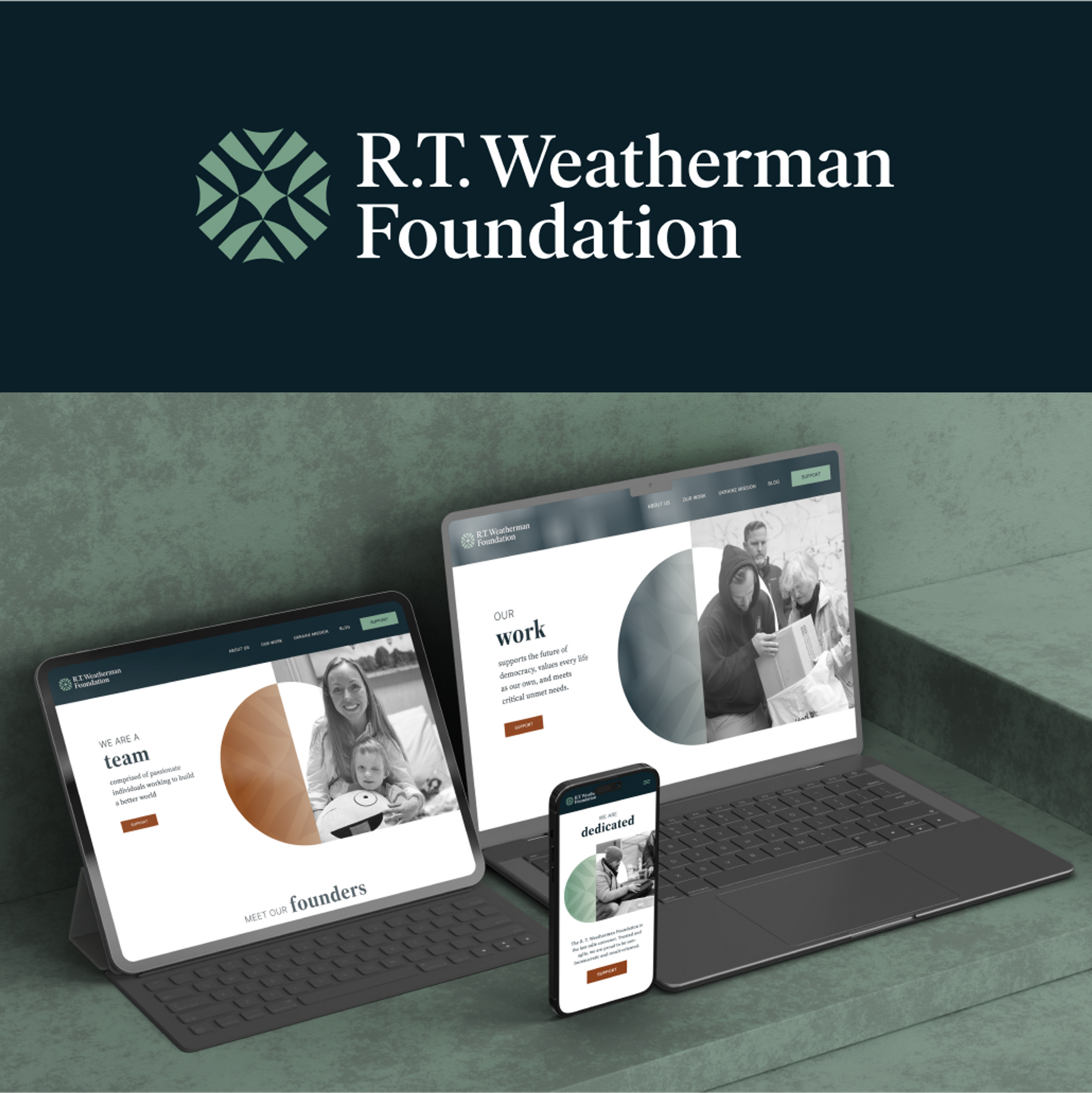
Weatherman Foundation's Rebrand and Website Relaunch
Our exceptional teams, including our talented Ukrainian colleagues, played a pivotal role in this project. They brought authenticity and deep insights to the website, seamlessly connecting the Foundation's mission with a global audience. From design and development to quality assurance, our teams meticulously optimized every aspect for maximum impact.
Read More